


Want to work with us?
Customer-centric approach as the key to success
Even though we have already been supporting clients in Switzerland, joining forces with WONDROUS AG will allow us to enter the market more quickly. Being closer to our existing and potential clients in Switzerland and offering them a broader range of competencies will provide enhanced customer support and experience.
“Parkside and Wondrous teams and market segments are a perfect fit. Our common goal is to support innovative companies to penetrate future markets with digital products and platforms, while keeping the focus on customer experience.”
— Christoph Platzer, Parkside Interactive CEO
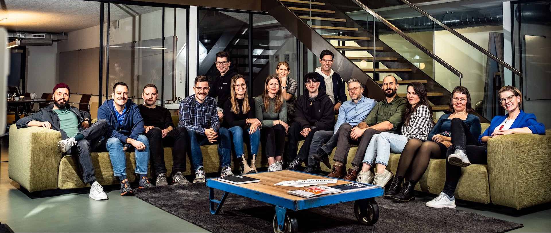
The Basel-based digital agency WONDROUS is known for its work for clients such as Novartis, Roche and Daimler and has been designing and developing digital products and services since 2008. Wondrous’ management is pleased to have found a strategic partner in Parkside Interactive, through which their existing clients will not only continue to receive seamless high-level support, but also benefit from additional services (QA, data science and e-commerce).
“We are convinced that we are going to complement and strengthen Parkside Interactive in a meaningful way, thanks to our strong client portfolio in the life sciences and health tech sectors and our proven expertise in user experience design and web development.”
— Michael Beglinger, founder and former majority shareholder of WONDROUS
For additional details please see our official press release*.
(*press release is in German)